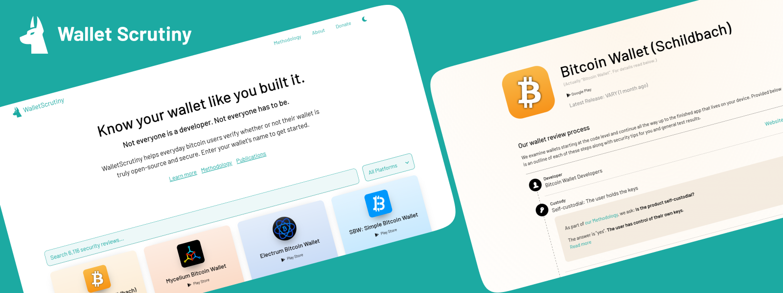
Wallet Scrutiny
How it started #
In November 2022 the Wallet Scrutiny project was introduced to the Bitcoin design Community. They are a small team producing an extensive amount of work and are on a mission to improve their website and increase their reach in the ecosystem. The Bitcoin Design community kicked off a redesign process with the project to help them reach their goals. The overarching goal was to redesign the website with the goal of improving the user experience.
What does Wallet Scrutiny do? #
Wallet Scrutiny is a website that helps everyday bitcoin users verify whether or not their wallet is truly open-sourced and secure. They aim to improve the security of all bitcoin wallets by open sourcing the evaluation of their source code. They do this by focusing on the reproducibility of wallets, which ensures that the wallet a regular user uses actually matches with the code published online.
They:
- Produce security verdicts on 3000+ mobile and hardware wallets
- Write in-depth documentation on the analysis of each wallet
- Maintain a high-quality security review methodology
- Provide navigation of wallets and verdicts via search
The process #

1. Discovery #
The designers were not familiar with reproducibility and security review methodologies. So we had several calls discussing with the whole team, and spent study time becoming familiar with the subject matter. This was a necessary foundation for then being able to guide an informed design process.
2. UX plan #
We came up with a plan of how to best approach the redesign process. The process was bucketed into 3 main areas.
-
Branding: How can we create a visual experience and tone of voice for people who visit the website and that reflects the ethos of the project?
-
Webdesign: UI design: How can we redesign the website to meet the needs of the 3 user groups? Copy design: How can we improve the copy of the website?
-
Information design: How can we go into the methodology and best communicate the result of the security reviews? How can we create an experience that is easy to navigate and allows the user to perform their main goal when visiting the website?
3. User groups #
Three distinct user groups were identified. These user groups were identified by sitting together with the project members and ideating on who was the audience that they were intending to serve.
-
Wallet end users: Generally refers to an individual or entity who uses a digital wallet for personal or business purposes.
-
Security experts: People with technical knowledge as to what it entails to look at the code of a wallet and determine if it is reproducible
-
Wallet providers: A wallet provider is an entity or organization that offers services and tools for individuals and businesses to store, manage, and transact with cryptocurrencies and digital assets. These providers offer various types of wallets, including software wallets, hardware wallets, and online wallets, to cater to different preferences and security needs.
One of the goals of the redesign was to ensure that the website served the needs of these 3 user groups
4. Baseline testing #
We started off by looking at the current user experience. To understand how people were using the website, we decided to sit down with them and provide them with a task to complete on the website itself. This would reveal the main friction points in the website as well as how the website is used by people. To do this we decided to do some usability testing.
Usability tests were done with 5 people, wallet security was important to every person that was interviewed. We rallied in the help of the bitcoin design community and scheduled calls. We then shared the research findings research findings with the team.
Some of the key findings that came up in the user interviews was the following:
-
Educate: We needed to educate users on understanding why wallet security is important.
-
Build trust: We needed to build trust on the homepage for users so that they feel 100% comfortable and confident on choosing a wallet.
-
Call to action: We needed to provide a clear call to action on the homepage so users know which is the best first action to take. The interviews also revealed the search terminology as well as the current places where people were looking to understand the security of wallets.

5. Re-brand #
We wanted to help the project with its own unique brand and feel, this would involve a new logo as well as colors and fonts as well as the overall feel of the website.
We did a branding exercise with the team to identify the brand personality, project values as well as the feel that they would like users to experience when landing on the website.
-
Brand personality: A brand personality that felt formal, conventional, functional, inclusive and conservative
-
Strong values: Transparency, Approachable, Inviting
-
Would like users to feel: Respect for wallet privacy, care about wallet security
-
Colors: White, Black, warm tones

6. Re-design #
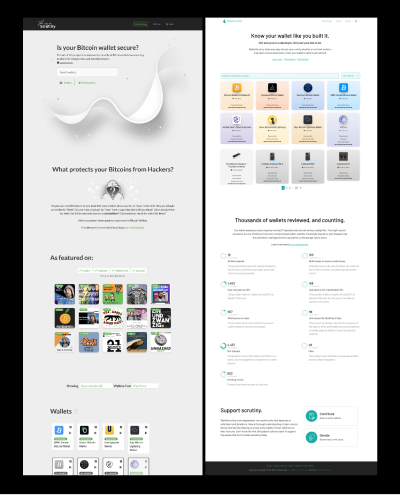
A new home page design was then created and shared with the team. The new design had the following elements. Below we will describe the biggest revisions as well as the rationale behind them:
Branding: #
The brand direction was designed to feel functional and inclusive yet trustworthy. The logo of the dog with its ears up came about from an idea that the Wallet Scrutiny team/website would bark when they spotted a wallet that they tested which did not pass all the tests.
Why: The feeling that a user would get when arriving at the homepage would largely be determined by the tagline as well as the overall feel and branding. We wanted to use color and copy to create an inviting and trustworthy feel for users.
Homepage: #
The copy and UI design was something that we focused a lot on for the homepage. Copy being an essential part of design was tricky with a project like Wallet Scrutiny. We had the help of a copy ninja and he helped us to create a catchy headline as well as revise all the copy on the homepage and methodology page. The homepage was designed with a strong call to action with the search bar as well as a nice tile overview of the wallets on which reviews have been done. Showing the wallets that passed all the tests right from the homepage and allowing a filter option to sort through the reviews.

Why:The strong call to action of typing into the green search box was intentional to allow the user to search straight away for the wallet they are using or were thinking of using.
Essentially there are 4 main categories in which wallets would fit in; android, iphone, hardware and bearer. We wanted to create a quick filter option of this as well as present a default view of the wallets that passed all the tests.
Methodology page: #
The methodology page was revised with a focus on 2 directions. We revised the copy as well as the navigation structure. The page was broken up into 3 sections. Introduction, tests we run as well as FAQ’s.
Why: The original methodology page was a single page outlining the full process. Trying to find a simple, easy-to-read structure for this diverse mix of security data and test results was a unique challenge. Since the process to evaluate wallets is a lengthy one we decided to break this up into 3 distinct sections. The reason for breaking this up would allow for easier readability and navigation. The copy of the methodology page was also worked on to improve readability by looking for opportunities to simplify the content.
About: #
The about page showcases the team behind the project as well as any public interviews or podcasts as well as who the sponsors are of the project.
Why: The goal of the about page is to create a sense of credibility and trust for the user visiting the website. Showing the supporters of the project as well as a human element showing the team is intentional to create this.
7. Re-testing #
The second round of usability tests were carried out after the redesign of the website to see if the new design allowed for an easier user journey. The research findings can be viewed here.
The redesign was appreciated with a lot of enthusiasm. The comments were:
-
Clean design: They loved the clean and neutral design. People felt they could relate to the content more this way.
-
Easy to read: People found the methodology easy to read and mentioned that it helps to show what went wrong in the testing process.
-
Details: Developers liked the in depth explanations and the details of what went wrong.
Insights #
Consensus: Design is an iterative process that requires the team being onboard with the direction of the design as well as the UX strategy. Building consensus was an essential part of the collaborative process.
UX research: Understanding the current user experience during the redesign process helped us to understand the main user flow of the users as well as which areas of the website created the most friction.
Consider the users goals: Understanding the user groups who would visit the website helped us to understand the shortest user journey that would help them to meet their main goals. This helped with the information infrastructure.
Trust: Creating trust throughout the user experience was something that we tried to incorporate using design, this was essential to keeping the user engaged and trusting the reviews.
Conclusion #
As a community we really enjoyed working with this project and sprinting towards the redesign of the website. The entire process took about 6 months in total and we jumped on weekly or bi-monthly calls to keep momentum. The redesign of a website is an intricate process that requires a team effort as well as understanding the needs and goals of the people using the website.
With that said this project is not finished, while we made a lot of changes in the redesign process the next steps with this project is to get the project in front of the world and gather feedback and speak with users and continue to iterate. There is more work to be done on the expert opinions, how the project could integrate Nostr and so contributions to that effort would be much appreciated.
Acknowledgements/Gratitude #
We would like to thank the Wallet Scrutiny team for their willingness to collaborate as well as members of the Bitcoin Design Community who rallied together to make the redesign process a reality. Christoph, Mogashni worked with the team over a longer duration to make the redesign a reality. We’d also like to give a shout out to our anonymous copy guy who spent a lot of time rewriting all content for length and clarity and come up with some headlines that really capture what Wallet Scrutiny does while still being catchy and approachable.
Moving forward we will continue to support the project to bring more awareness to wallet reproducibility in the form of education as well as support in the design.
Resources #
Previous case studies:
Links to project resources:
Next, view the resources a collection of design resources to that can help you design and build better bitcoin products.